The Ukraine has a brand guide.
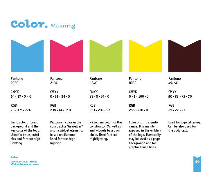
II’m not surprised. It’s obvious the Ukraine have worked hard at everything, to present themselves as the advanced country they are and have to be in the shadow of Russia. I can’t say I loved their colors when the country were first thrusted onto the awareness of the world, but I’ve grown to love the bright, enthusiastic colors that so tightly connect to the wheat, and the sky the country is so famous for. Colors that are different from the ancient and weighted colors and visuals of what came before.
Since the war began, I’ve been consuming everything Slavic, and taking a deeper look at media, movies, music, from movies ranging from Dr. Zhivago, to Nicholas and Alexandra. As well as Enemy at the Gates, a movie that paints an amazingly gruesome story of the Battle for Stalingrad which paints Russia’s strategy of simple pounding their enemy’s into dust, which is what they are doing in Ukraine.
Under the weight of all that history, contrasting it against today’s brutal war, to me shows branding, as an advanced weapon used for good.
We’re watching a war in real time. It looks like WWII movie, but the actors are actual humans, living, surviving and dying in real time. Their branding feels like hope, like victory.
Want to win big on your next campaign?
Call today and put a proven creative team to work for you!
Dwight Ingram | Creative Director | IngramCS


Leave A Comment